Making an Insurance Company Look Better than an Insurance Company
Stephen Stewart Risk Underwriting (SSRU) is an insurance company based out of Toronto that specializes in corporate re-insurance across multiple disciplines. They approached Graymatter looking to revamp their online presence and create a website that conveyed a more contemporary look for their business. In conjunction with the web redesign exercise, we also evolved their logo to use a new font and be more balanced with horizontal and vertical applications that ensure the descriptor type was legible.
With the website setting the tone for the new company image, Graymatter also embarked on redesigning their business cards and stationery, as well as creating a set of product sheets that could be distributed by their sales staff.
Not Your Average Insurance Company Website
We went about redesigning the website to feature a more dynamic charcoal grey and gold colour scheme that allowed the imagery to really pop. The Wordpress site was given a clean, spacious layout with some distinct animation features that really position it as a professional company. An angled pin-stripe pattern was introduced, along with various headline fonts and background type that gave the site personality.
https://ssru.ca/
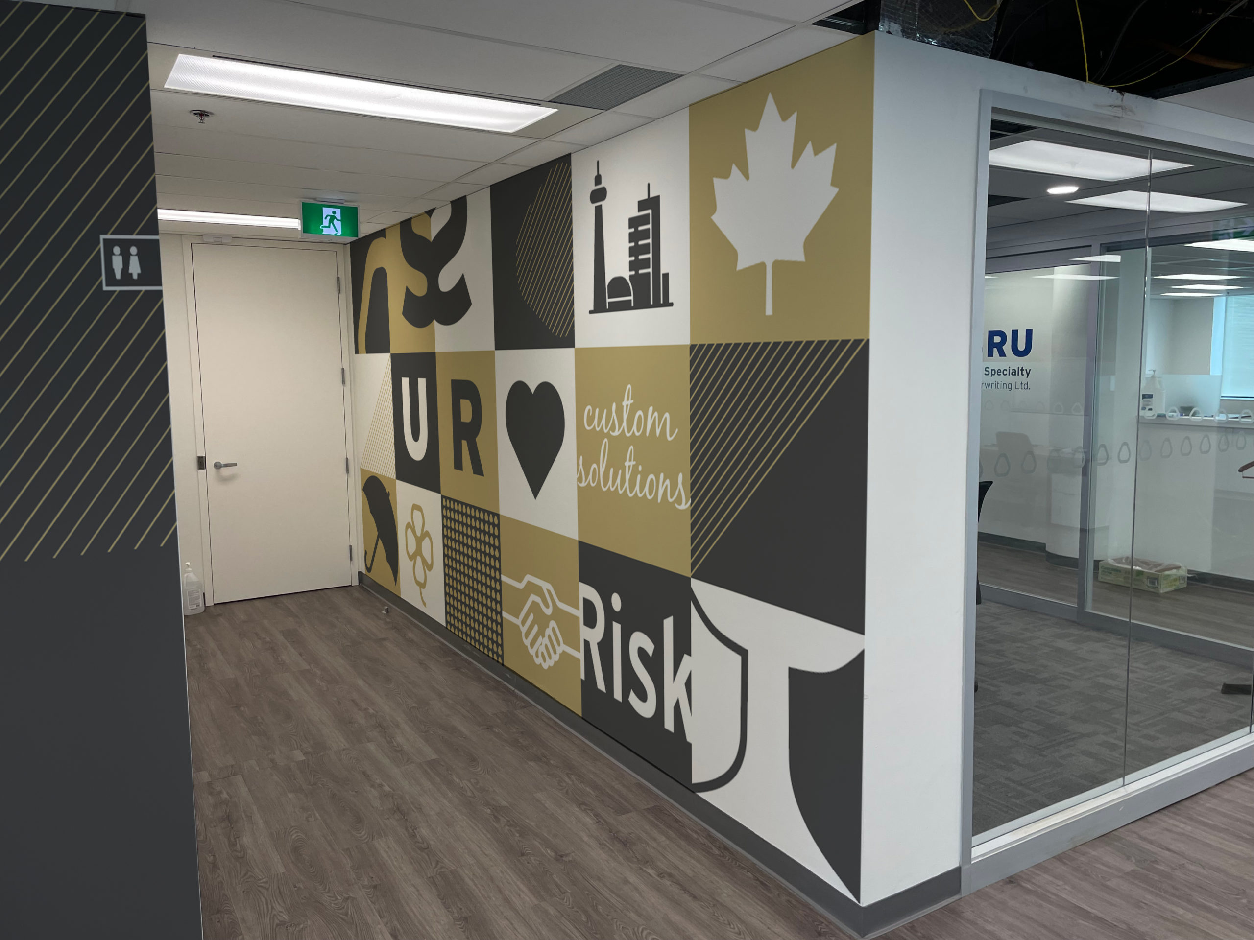
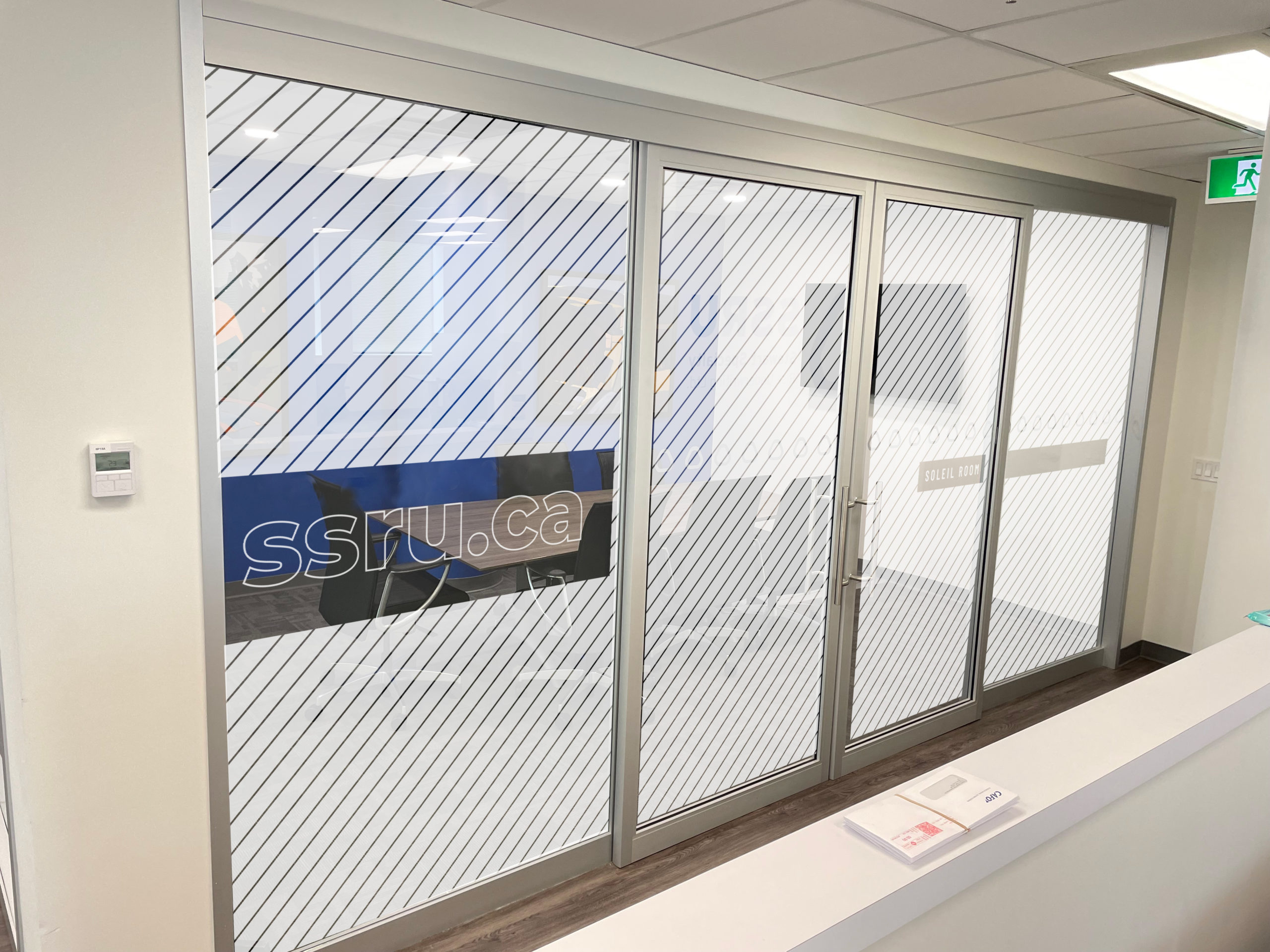
Graymatter was then then engaged to apply the new brand image to their office space to apply the same consistent colouring and personality to the environment. The concepts featured some light-hearted variations on their brand and colour scheme, plus some artful components that added personality to the space. Graphics were designed to be applied using a combination of vinyl graphics and paint.


NEXT CASE STUDY >

Documentary Organization of Canada