Helux is an enterprise content expert that helps customers maximize the potential of their information. They implement processes, tools, training and experience that helps organizations manage content more effectively. They engaged Graymatter to evolve their brand and their on-line presence to be more polished and professional.
We began by addressing the brand identity and exploring ways to modernize the look without completely losing the equity of their previous logo. We retained the circular 'H' icon but modified the details and introduced a magenta to cyan gradation that made the overall design feel more dynamic. This was complemented by a lower case, approachable word mark done in a deep purple to compliment the colour scheme of the icon.
We created a comprehensive graphic standards guide for the Helux brand that covered all applications of the logo, the brand colours, the typography as well as secondary graphic elements and photography/illustration. The purpose was to ensure a tight and consistent translation of the assets to all future branded elements.
Content... and clean design... are king
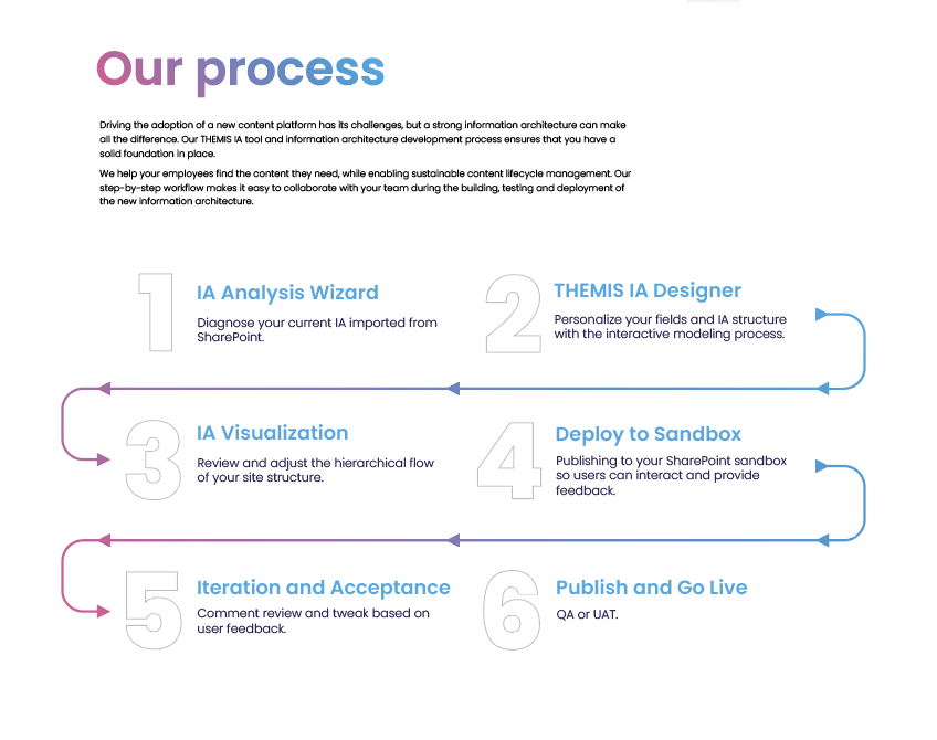
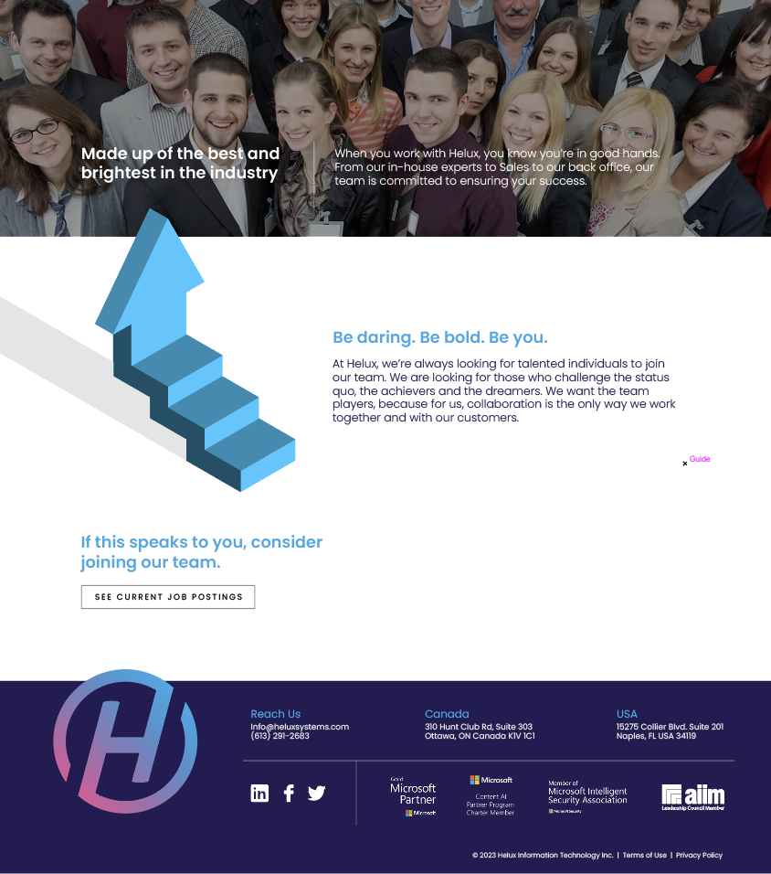
For the new Helux website, the goal was to convey the company as a technology-forward business, but in a way that was inviting and friendly. The essence they looked to capture was that 'content management does not need to be daunting'. To help capture this, we kept a clean white base to the design to offset the bold colours of the logo. The colourful gradation was carried through in the large headline copy as well as some of the roll-over states. A distinct collection of 'sun-warmed' photography and bold, illustrative elements was created to give the site a distinct look that could be carried through all touch points of the brand. The use of plenty of quiet space gives it an airy feeling that makes it pleasant to navigate and each to digest.
helux.ai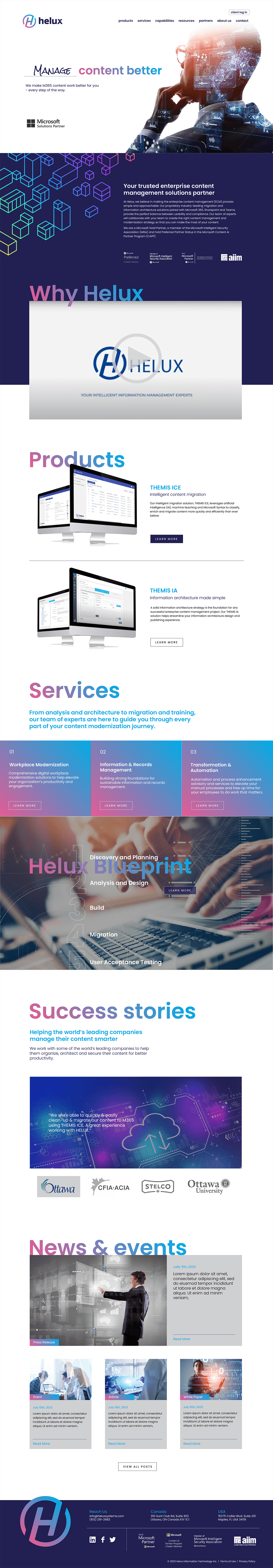
Content... and clean design... are king
For the new Helux website, the goal was to convey the company as a technology-forward business, but in a way that was inviting and friendly. The essence they looked to capture was that 'content management does not need to be daunting'. To help capture this, we kept a clean white base to the design to offset the bold colours of the logo. The colourful gradation was carried through in the large headline copy as well as some of the roll-over states. A distinct collection of 'sun-warmed' photography and bold, illustrative elements was created to give the site a distinct look that could be carried through all touch points of the brand. The use of plenty of quiet space gives it an airy feeling that makes it pleasant to navigate and each to digest.
helux.ai The robust website features a series of design elements throughout the pages that bring consistency and distinction to the site.
NEXT CASE STUDY >
Twin Protocol